Jeanine Thomlinson here to talk about fabrics! As we all know our stashes can be HARD to cut into, but there is nothing more satisfying than picking the perfect fabric for your project!
Today we are going to talk about picking fabrics to compliment the design, but mostly, pick a fabric you LOVE! This is your purse and you want it to be something you will enjoy using.

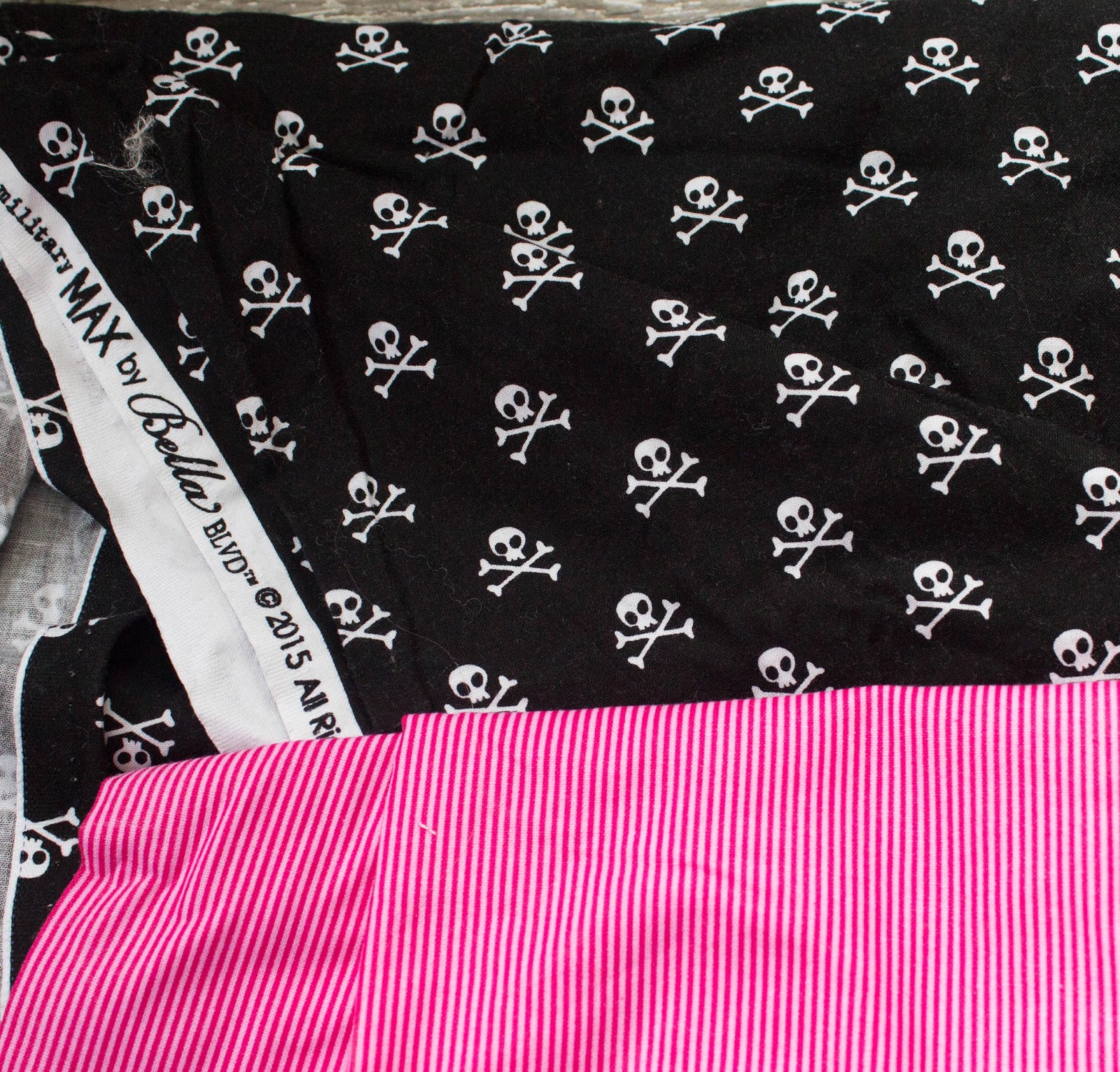
This bag has some unique features. The most prominent one being the front pocket with its unique envelope like fold and the flap.
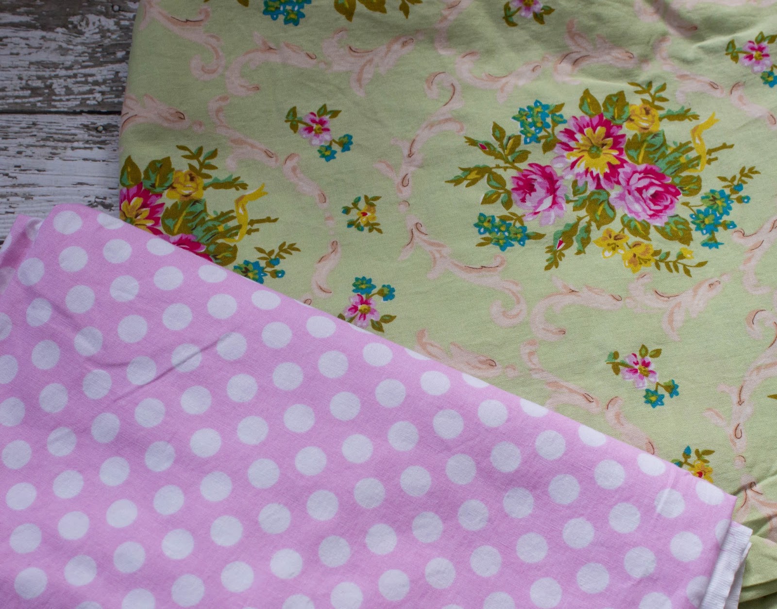
The flap and bottom and strap are great to do in your coordinate fabric. In this set the polka’s would be the coordinate. But the print worries me because of scale that it would not do anything to highlight the envelope pocket. As you can see below, when folded. it isn’t AWFUL, but it also isn’t exciting.
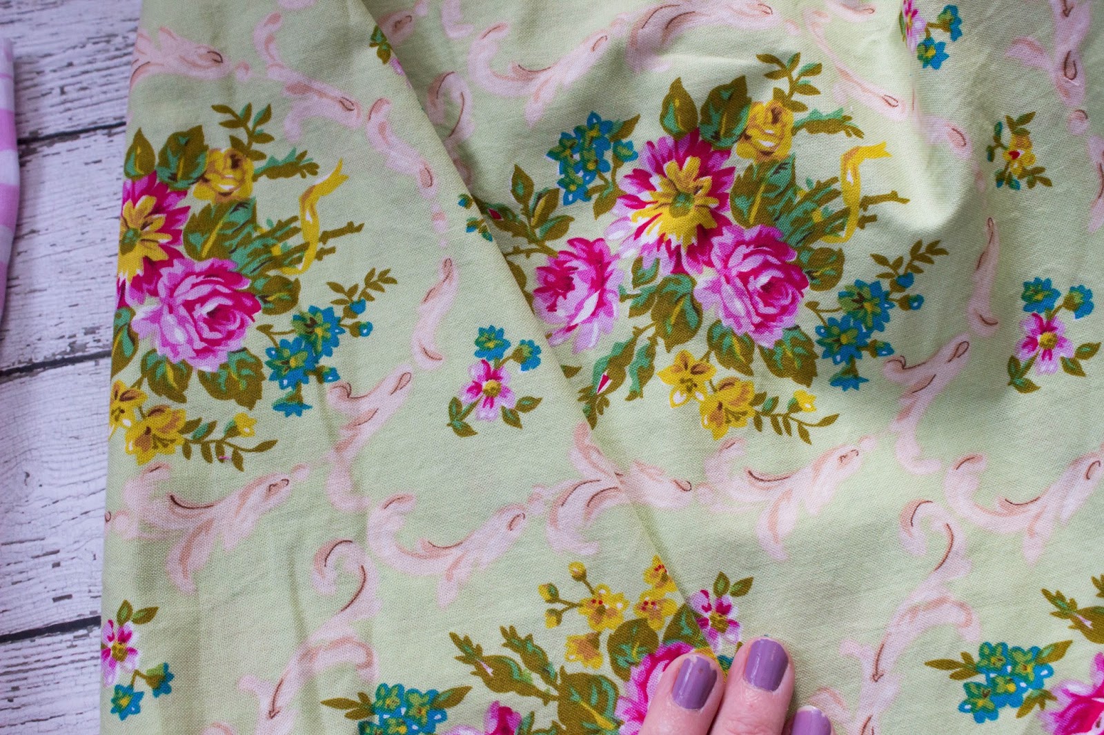
This print the scale is MUCH too large. Not only is it not exciting but it would make the pocket stand out on all the wrong ways.
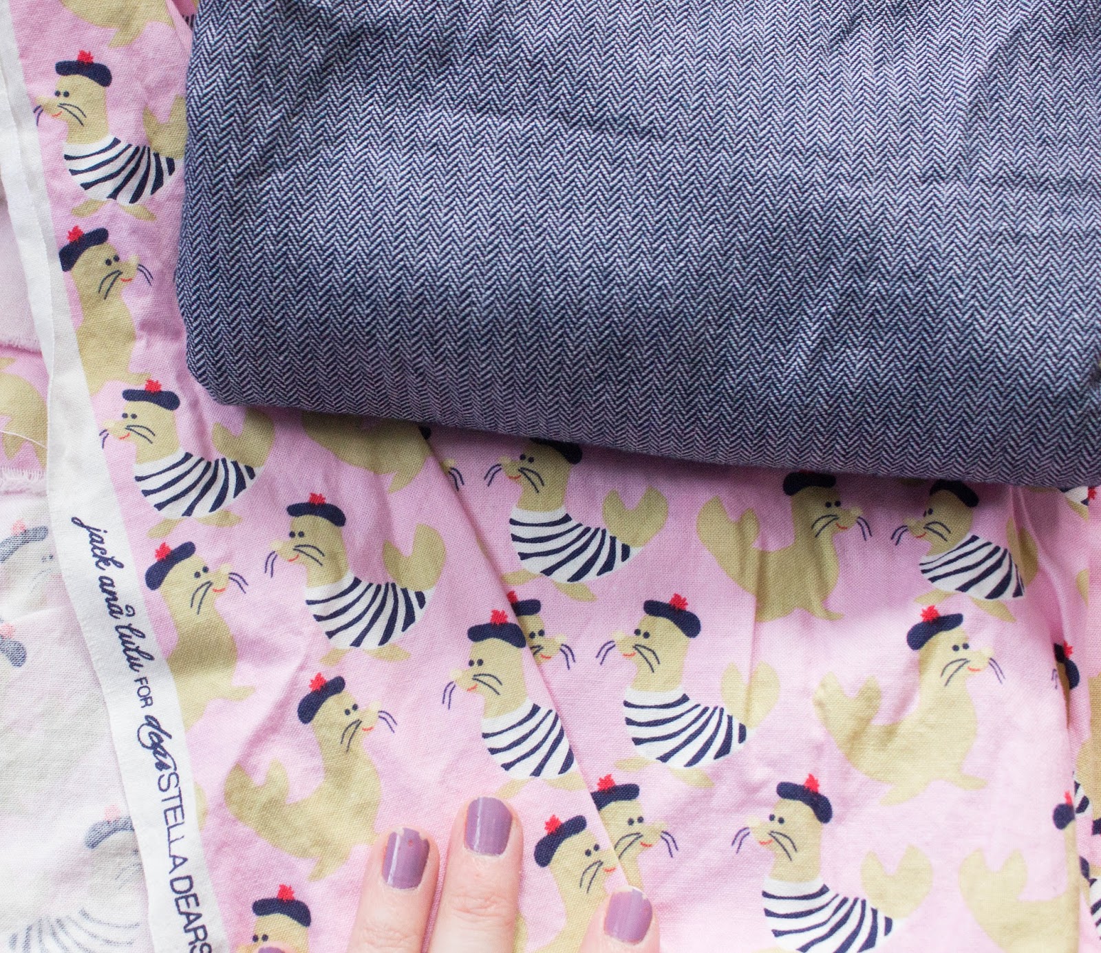
I LOOOVE the navy herringbone chambray for a coordinate!!! and I adore the funny French seals, the pocket would work… though the print is a bit bold for the best look…. but this combo is in the running.
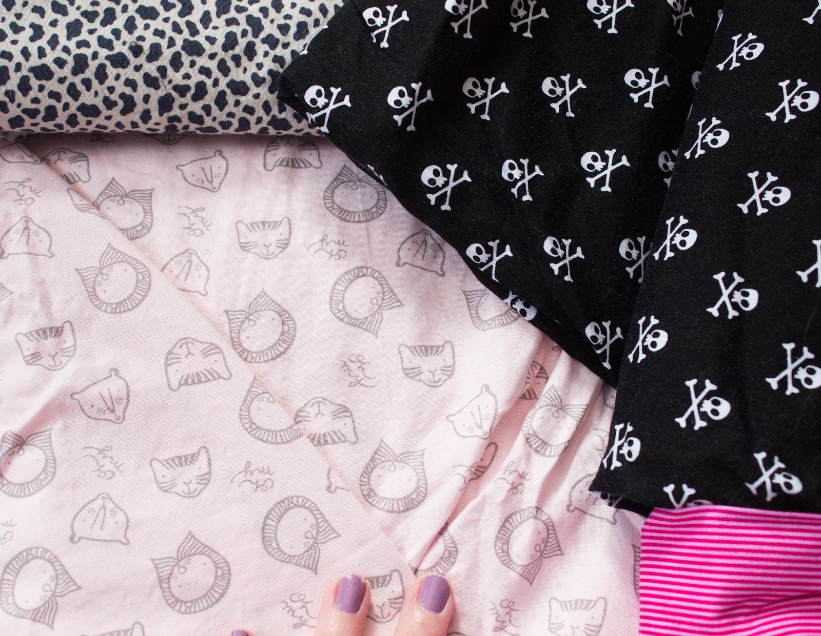
I think this print works great for the main, the scale is good, the pattern is bold enough, but also light enough that the envelope pocket would get the appreciation it deserves. A few coordinate options … Under the pocket flap and the inside fabric could be a great place for a bold fabric choice. Another option in the running.
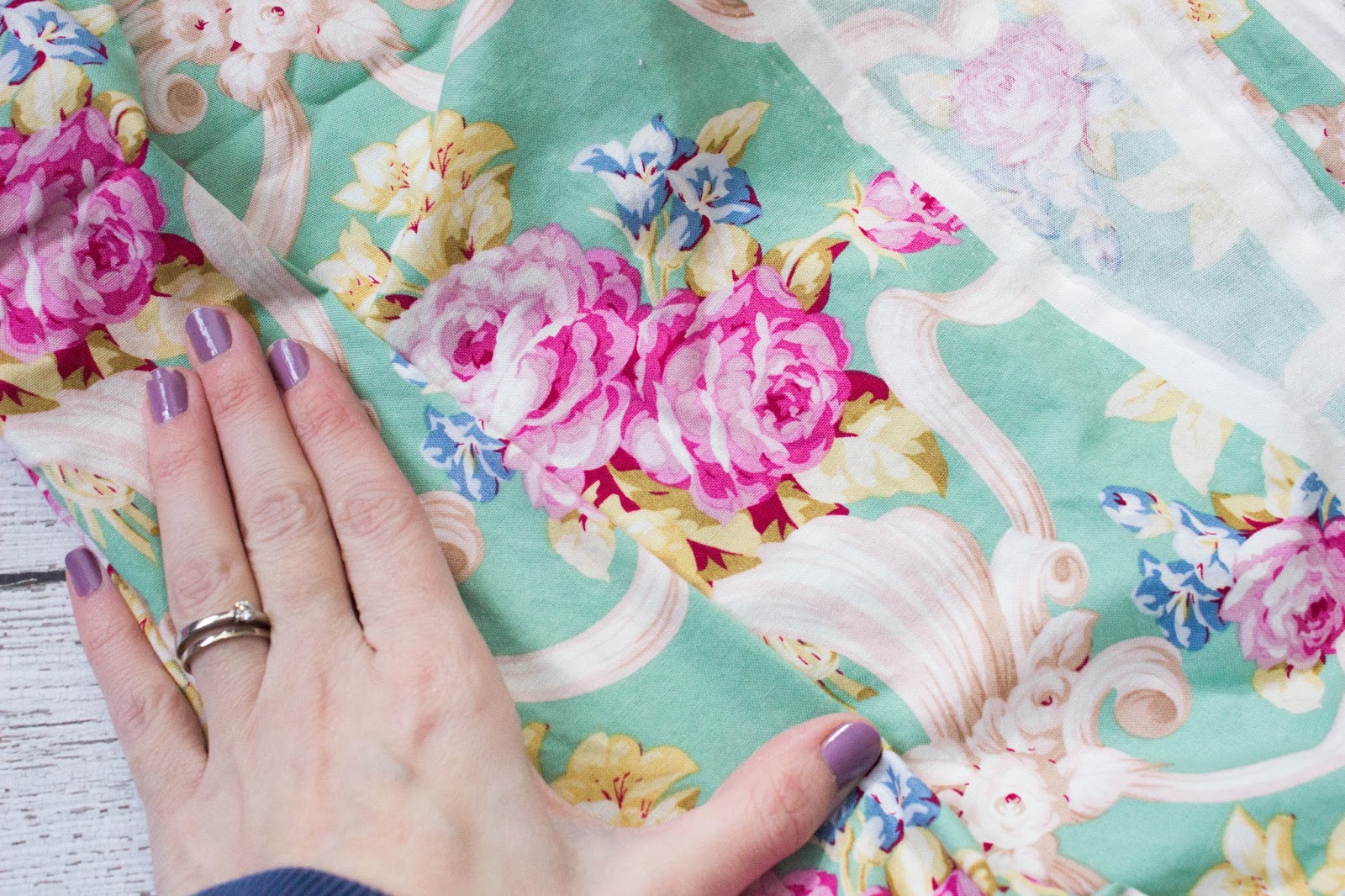
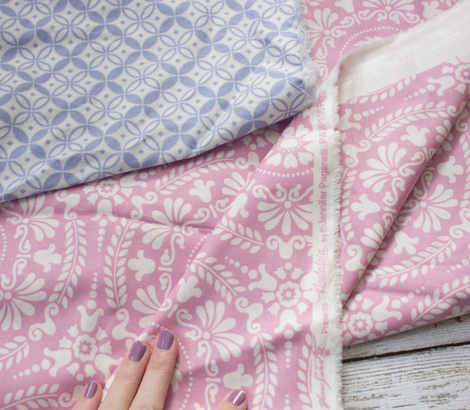
These both would work as a main and a coordinate. pretty, subtle tone-on-tone colours – fab pastels. could still pick a bold bottom such as a white fabric vinyl. Another option in the running….
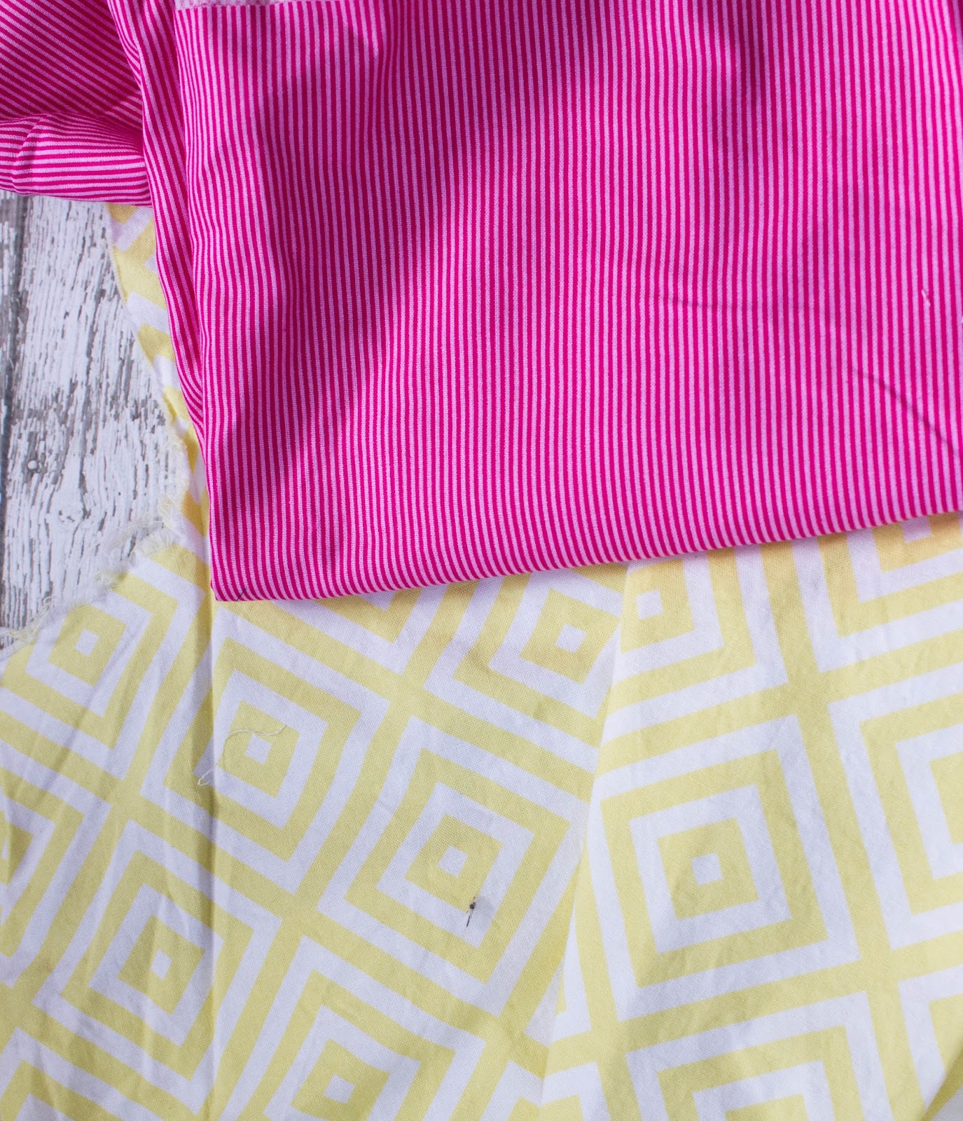
Love the color combo… But I think the yellow would work better as the coordinate and the top would show off the envelope-style pocket better… Not sure I can bear to demote the bold print to a coordinate though. (I LOOOVE my fun bold prints!)

You could also go neutral in patterns and bold contrast in colors! Both these work for main and coordinate. paired together it reminds me of lemonade and summer fun!
As you can see just from this small sampling there are SOOOOO many options when it comes to how to pick your fabrics! Bottom line is you don’t want a large scale print that will distract from your details. purses are work, we want those details appreciated ! But, also don;t be afraid for a bold pop of colour. If being bold is not your strong point, try a pop under the flap or on the inside of your purse.

And don’t forget, each Seneca Creek pattern comes with it’s own coloring page! Print it out and color it up to experiment with different fabric placements. So much fun…
Which pairing shown do you think I should choose? How did you decide on your fabric pairing for your Seneca? Share in the comments!


All those different parts make it fun to combine fabrics!
I love the Color Brigade pair! I think the bold print as the accent would work very well.